
.jpg "Jo McLaughlin")
Case Studies
Related webinars
Every detail matters: Hidden branding opportunities in student recruitment
Every detail matters: Hidden branding opportunities in student recruitment
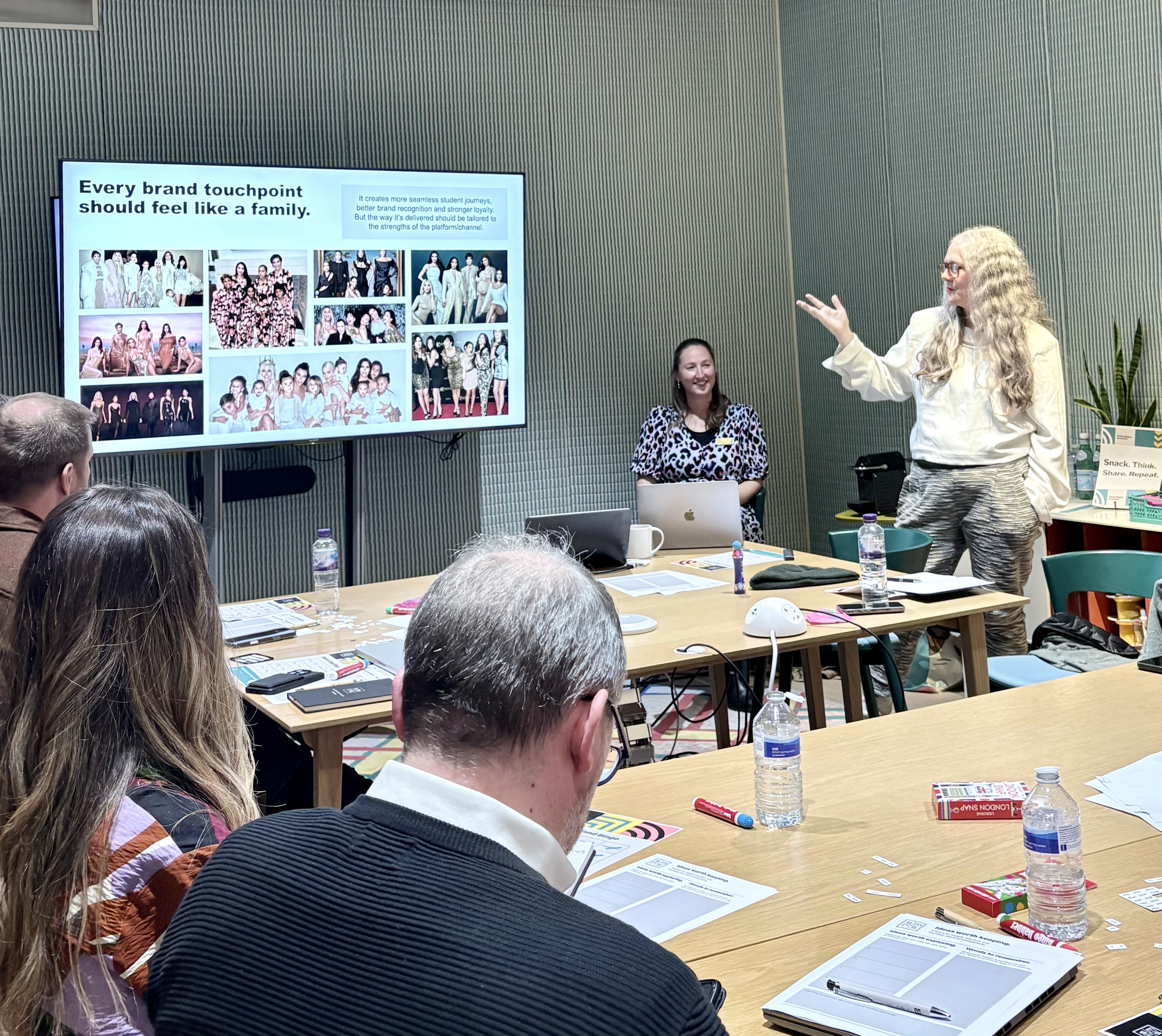
When it comes to student recruitment, it’s easy to focus on the obvious: the homepage hero image, a beautifully crafted prospectus, the perfectly timed open day, or a social campaign that could double as a portfolio piece. These all matter, of course—but the most powerful opportunities to shape perception often lie in subtle, easily overlooked moments.
Every interaction a prospective student has with your institution—even an out-of-office email, a quietly insistent cookie banner, or the tone of a form’s placeholder text—speaks volumes. The devil is in the detail, and it is in these nuances that trust is built, personality is revealed, and a memorable impression is made.
The little things that matter – Our favourite ways to make your audience feel seen
Prospectus request confirmations
A prospectus request is often the first active signal of interest from a student—the moment they move from casual browser to imagining themselves at your institution. That confirmation email, landing seconds later, is far more than an administrative receipt. It’s your first opportunity to say: “We see you. You’re in the right place.”
In the UK, where students often compare universities side by side across similar courses, this micro-interaction becomes a subtle differentiator. The tone you adopt—warm, confident, informative—sets the emotional benchmark for everything that follows.
A strong confirmation message does more than thank a student for clicking a button. It gently pulls them into your world. Leading UK universities now treat this moment as an onboarding touchpoint rather than a transactional one. That might include:
- A short, human welcome: “Great choice—your prospectus is on its way.”
- A virtual tour or campus snapshot to help them visualise the next chapter.
- A student story or ambassador introduction, offering a peer voice rather than institutional marketing.
- A clear next step, such as signing up for an open day or joining a subject-specific mailing list.
These small signals build familiarity—and advocacy—earlier than traditional recruitment timelines assume. With rising costs and increasing competition, reassurance and relatability matter deeply. Think of this confirmation as your “welcome to the club” moment: a small, perfectly judged nudge that says, “You belong here, and we’re excited to show you why.”
Email footers: More than just contact details
In student recruitment, email footers are subtle but powerful touchpoints. More than a logo and contact info, they reinforce your brand, highlight opportunities, and make engagement easy.
Consider including links to:
- Social channels: Let students explore campus life and your community.
- Key events: Open days, webinars, and campus tours encourage active participation.
- Resources: Prospectuses, application guidance, or FAQs provide value and build trust.
A well-designed footer ensures that every email—whether an update, invitation, or newsletter—communicates its primary message while gently guiding students towards deeper engagement. Even small additions, like links to open day registration or outreach pages, create meaningful touchpoints.
Form field placeholder text
Forms are everywhere in UK student recruitment—enquiry forms, open-day registrations, accommodation requests, funding applications, clearing forms. Each is a micro-moment in the decision process.
Many institutions still default to dry, administrative language (“Enter your details”), which does nothing to reduce friction or convey character. Small shifts, however, make the experience feel lighter, more helpful, and human:
- Instead of “First name”, try: “Your first name (so we know what to call you).”
- Instead of “Email”, try: “Your email (we’ll only send useful stuff—promise).”
- Instead of “Submit”, try: “Send it over,” “Register now,” or “Let’s go.”
These micro-copy choices create a supportive tone that mirrors what students want from UK universities: friendliness, clarity, and the sense that the institution cares about them as individuals. During high-pressure moments like Clearing, wording that feels warm and reassuring can subtly lower anxiety and increase conversion.
Small details like these are where your brand’s humanity shows through—and humanity is often what students and parents respond to most during recruitment.
404-Error pages
Dead links don’t have to be dead ends. Outside higher education, brands like Mailchimp, Slack, and Lego turn 404 pages into playful, interactive experiences. Even when something goes wrong, these pages treat users with respect—reinforcing a friendly, approachable image. Here are some neat examples.
Even the goodbye matters: Unsubscribe messages
Every interaction counts—even the final one. Prospective students often take months to decide, weighing options and visiting campuses. A clear, considerate unsubscribe message demonstrates professionalism, leaving a positive impression even as a student steps back.
A warm, uncomplicated opt-out message, ideally paired with the option to adjust communication preferences, keeps the door open. Giving students the choice to receive only event invites, programme updates, or scholarship alerts allows ongoing connection in a way that feels relevant, not intrusive.
Such messaging signals confidence—not desperation. It shows respect for the student’s autonomy while leaving the relationship intact. Months or years later, students who left on good terms are far more likely to return with interest.
“Opted out? No problem! We’ve updated your preferences. You can come back anytime to get the latest on courses, events, and scholarships. Until then, we wish you the best in your journey!”
Why this works—and what you can borrow
All these micro-moments work because they treat prospective students as people, not data points. Each touchpoint—confirmation emails, footers, forms, cookie banners, 404 pages, and even unsubscribe messages—signals that your institution is thoughtful, approachable, and trustworthy.
Here’s what you can take—or adapt—from this approach:
- Treat every touchpoint as a mini-onboarding moment. A prospectus confirmation or a welcoming form placeholder is a chance to say: “You belong here.”
- Infuse personality without sacrificing professionalism. Simple language tweaks make forms, emails, or banners feel human and supportive.
- Think beyond the obvious. Footers, 404 pages, cookie banners, and unsubscribe messages are subtle stages to reinforce your tone and brand promise.
- Use visual and social cues strategically. A small image of campus life or a student story helps prospects imagine themselves at your institution.
- Build trust through transparency. Clear privacy policies, cookie banners, and opt-out options signal integrity and respect.
Bottom line: Small moments, big impact
Branding isn’t just logos, campaigns, or bold marketing moments—it’s every interaction, big or small. Each touchpoint is an opportunity to show care, build trust, and make students feel seen.
Treat every interaction as a mini-onboarding moment, think beyond the obvious, and infuse personality without losing professionalism. Small details done consistently turn curiosity into connection, and connection into commitment. Students may forget campaigns—but they never forget how you made them feel.
Other webinars
See all webinars-
Media Mapper 2026 Deep Dive
Explore fresh insights from SMRS Media Mapper 24/25, revealing how prospective students engage with media today. Discover evolving behaviours, key channels, and practical ways to refine your media mix and strategy.
Watch webinar 100 -

Changing Tides: How Institutions are reaching today’s students?
Learn data-driven student recruitment strategies and modern media approaches that boost enrolment, with real-world examples and actionable insights.
Watch webinar 100

In-person events
See all events-
.jpg "Sarah Sturgess")
ISE Student Recruitment Conference 2026
Heading to ISE? Meet SMRS on the exhibition floor to talk challenges, share ideas, and shape better early careers outcomes with industry peers.
View event 100 -
From noise to signal: How modern employer brands build trust, prove impact and reach the right talent - Munich
Join our Munich meetup on June 30, 2026, to explore effective employer branding strategies that build trust and connect with the right talent.
View event 100