How to scale and polish a careers site

Developing mydentist's online presence to reflect their new employer brand
We added sparkle
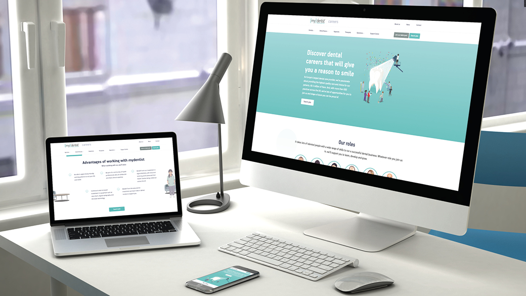
With a shiny new employer brand showcasing the personality of their people and the organisation, mydentist wanted their online presence to reflect this too. So we set about working with them to create a best in class website which highlighted the strengths at the very heart of their business and let their people take centre stage.
In particular, as mydentist had previously been viewed as a big corporate giant, they were keen for their new site to be as warm, welcoming and accessible as a visit to one of their practices is.
So, we focused on creating a careers site that:
- Was different in look and feel to the clinical look favoured by competitors
- Was clean, clear and uncluttered
- Was easy to use and simple to navigate
- Was tailored to the needs of specific audiences
- Delivered a powerful employer brand message
- Showcased the full range of roles and opportunities
- Gave a real insight into their character and culture
We performed a full examination
Analysis of the old mydentist careers site revealed that confusing and circuitous user journeys, mixed messages and too much detail led to a lot of drop-offs. Refinement and simplification of these routes to information and application was vital in order to make it as easy as possible for people to find what they were looking for and apply.
Analysis also revealed that the majority of traffic to the site (+60% in fact) was from mobile devices. So, there was a huge need for the design and layout of the new site to reflect this. For all copy and content to be clear, concise and to the point, with the design and usability being sympathetic to a mobile-first approach.
We built a solid structure
The new site was scaled-down. It was structured around the information we knew people wanted to access and constructed in the way we knew they wanted to consume it. For example, on the old careers site all video content was housed on one page. On the new one, video content was strategically placed alongside the information it related to. In addition, the site:
- was structured by role type, enabling attraction activity to be linked to role specific landing pages
- had regular links to the ATS, enabling candidates to more easily and immediately apply for jobs
- offered increased integration with social channels as, alongside footer links, the news section enabled the client to link content to Facebook, LinkedIn, Instagram and Twitter
- included a user friendly CMS, which mydentist staff can access to add their own news stories and update content
- clearly communicated the mydentist strengths, behaviours and culture
- contained ‘day in the life’ video content of roles we discovered candidates particularly struggled to understand
- used original photography and illustrations throughout to bring the employer brand personality to life.
We let people shine
The ambassadors chosen to star in the employer brand really shone online. A wealth of videos brought to life the character and personality of mydentist people, highlighted what it’s like to work in their organisation and encouraged others to want to do the same. Watch videos here, here and here.
It’s smiled all around
Since launch, the results of the new careers site have been impressive. As well as a happy client and a proud business, it’s had:
- 30,020 users
- 126,847 page views
- 26.41% bounce rate
- More than 1,000 applications
- An increased applicant conversion rate of 17% year on year
![]()